Thursday, October 31, 2013

Field trip

 This first work of art is one of my favorites from MIAD. It was at the top of the stairs and caught my attention immediately. It had a very simple composition, but through the use of simple shapes,  it created a overall striking image. The paint strokes really enhance the "tribal" character in this painting and actually makes it feel as if this person has war paint on. Although simple, it caught my eye.


  This technique of displaying this project was absolutely refreshing. I had never seen anything like this but I was interested as soon as I saw it. Initially, all I saw was black and white fabric lying on the ground. But now that I have the chance to look at it closer, I can see the image of a girl in it. It appears that she's upset and struggling and I think the violent and messy way the fabric is draped really enhances that message. I would love to try something like this for one of my projects.
 I particularly liked these edits, because I personally struggle when I edit. I find myself not being able to choose what kind of color or tone I prefer on a certain project, so I usually save two different copies until I can decide on one. However, this is just too cool of a project to single down to one image. I really enjoy the rule of thirds that the cat creates and how the lines lead my eyes through the paper. The lighting and use of space is also very unique.


 I really enjoy this few pieces, because they have a whimsical sense to them, yet I can tell they were all worked very hard on. Firstly, I absolutely love the color and use of space in the brain image. I would love to hang something like this in my room. I really feel the artist made this look like a finished piece of work instead of leaving some things out. They accomplished this, because they filled every inch of the canvas with something.


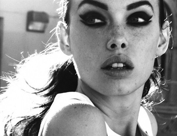
 These portraits struck me, because they were unbelievably realistic, had great attention to detail, really captured the mood of the person and accomplished great lighting and shading. I've never been good with drawing or painting people, so these seem like masterpieces to me. I love how they feel the page, but also follow the rule of thirds. Because of how close these are staged, it really gives viewers the opportunity to focus on all the detail and mark making the artist did. Maybe I could try to take portraits that are as simply striking as these drawings.


 This was one of the first things I saw when I entered the MIAD building, but I immediately knew I wanted a picture of it. I'm not exactly sure what media this would be considered, but I'll just call in a collage. I love the simple, yet captivating beauty and contrast that this project demonstrates. I love the heavy black colors and marks against the textured fabric. I also love that they incorporated the glass panel into this and that they put images behind it, especially images with great texture. I'm not exactly sure what their message was, but nonetheless, I was impressed with the overall composition.


 I think some of the most interesting pieces of artwork are commonly overlooked things throughout the city. I saw this on an old wall and was impressed. It's a great example of print and typography. It uses space on the wall and certainly has a message. Whoever the artist is, had a great idea, because they offered uplifting art to anyone who walked past.


 I found this metal design in the Katie Gingrass gallery and was taken back at the beautiful curves and texture. There is obviously a lot of detail in the shape of this work of art. I like how it branches out and fills the frame it's in, yet allows us to see through it. Previously mentioned, I really appreciated the rough texture and dirty, rusted metal color it had. It had a really rustic, yet beautiful feel to the composition. I'm sure shaping metal that delicately is difficult, so I had a lot of respect for the artist that created it.


 This was also taken the Katie Gingrass gallery and I found myself coming back to it over and over again. The glass had such a smooth and perfectly formed surface to it and I couldn't help but appreciate how soft it looked. In fact, I was tempted to run my fingers across it (I didn't, of course). I've never blown glass before, and I have no idea how the artist constructed such a perfect shape with such a pretty color scheme, but I think it's a beautiful piece.


 This is a photograph of my own, unedited. I didn't feel like editing anything I found in the third ward, because I felt that everything I saw was already a piece of art in itself and I didn't want to change it. This was taken in the Champagne Studio and I immediately noticed the great texture, lines, and possible rule of thirds that this window displayed. It also let in great light and shadows. I could have stayed there all day and taken numerous photos of the window, seeing all the different ways that I could have played with the light.


Like I said previously, I think some of the most beautiful pieces of art are things just found while walking through the city. I noticed this and had to take a picture of it. Perhaps I love the third ward so much, because there is just so much positivity and uplifting, free, artwork to be seen. This simple font on a wall caught my eye and I appreciated it for the contrast, smooth lines and the message. I'd love to continue to visit the third ward and see what other beautiful works of art I could discover.

Monday, September 23, 2013

Research

Impression Sunrise
Impressionism: a style in which the artist captures the image of an object as someone would see it if they just caught a glimpse of it. There is lots of color and most images are of outdoor scenes. They are bright and vibrant, yet without detail; just bold colors. They are soft, dreamy,and have a painterly feel. 

After researching on arsty.net and artbabble.org, I've gotten a pretty decent idea of what Impressionism is. Important aspects of this style is color (light flickering off water, moving clouds, a burst of rain), light (quickly shifting light on a surface; this is an important aspect when considering the blurry and soft feel of this type of art), and the lack of finish (appearing as rough, unfinished sketch, lacking detail, adding to the softness) However, I also researched Impressionism photography.

I'm extremely excited for this assignment, because being a photographer, I would love to try this new style. The picture above really follow Impressionistic styles and techniques. It's dreamy, a little blurry, and it resembles blotted paint strokes. I believe it will be a little bit of a challenge to incorporate rhythm into this since the majority of Impressionistic photos have a soft look that flows. However, I think that will make for a really interesting and striking image. I'm gong to accomplish rhythm through the use of my helper media. 
     Because I need to show a breadth of things in this project and throughout the whole class in general, I'm going to mix photography and acrylic paint, the paint being my helper media. Impressionistic photography already has a very soft and painterly feel to it, but I'm going to attempt to make the photos just slightly sharper than the one above and add the soft paint feel to it through the actual use of acrylic paint. Through the direction of my brush strokes, I will add slightly noticeable rhythm. Just enough to incorporate it, but not too much as to distract from the smooth feel of the image. 

Wednesday, September 4, 2013

Wisconsin Art

Sunrise, Lake Minocqua


I LOVE these two pictures from portalwisconsin.org. They both have amazing contrast, lines, and shadows. They also share a kind of asymmetrical balance that is interesting with the scenery.
Law Office

PortalWisconsin was an effective website to use. I really appreciated the professional manner of this site. It was nice, because not only was it well organized and easy to operate, but that enhanced my overall experience discovering new photography and artwork.
    It also gave off a very strong sense of community. I could tell that by their scheduled activities and events, their many offered opportunities for grants or internships, and recognition of the effort kids put into their art, that this site is very intune to its community, especially its young artists.


Artsboard.wisconsin.gov

I didn't really like this website. It was confusing to use. I couldn't even find a section of the site for photography, so there's no pictures. However, I did learn that they offer many grant programs, internships, and they promote art in many different ways. It's a very good site for community building among lovers of art.


Kitchen LightScholastic.com was really fun to look through. It was an easy way to discover art from fellow students. I really like these two pictures because the contrast and editing is intense and caught my eye instantly. It makes me wonder what the photographer was thinking when they took these. I learned three things from this site. First, was that scholastic had programs to recognize young artists! I wasn't even aware they did this. Second, I learned that they could offer scholarships for the fortunate young artists who stood out. Lastly, I learned that professional, well-respected and well recognized artists are a part of this board. How cool would it be to have your art praised by Andy Warhol?!


Behind The Wire


Thursday, August 29, 2013

Outside the box


Straying away from my usual couture photo shoots with models, this is a type of photography I've always wanted to try. I've seen my dream college advertising these types of photographs, so I would love to be able to send my own in to them. I've tried researching this, and how to do it, but it seems kind of complicated and I definitely won't be able to just use my iphone for this. I'll need a real, professional camera that allows for long exposures. I definitely feel like this type of photography is for me.

Tuesday, August 20, 2013

Progress...


WOW! So I'm a 17 year old high school student who was just asked to do senior pictures by a parent. I'm so honored! The photoshoot I did with gabby turned out so well that her mom wants me to do her senior pictures! I'm so glad that they liked them THAT much! I'm nervous though, it's a big deal. I'm worried I'll mess them up and I DO NOT want to mess up someones senior pictures. I'll wait and see what they decided. I told them I had no access to getting prints for them and I could really only email them the finished photos...lol. They also said they would pay me(; so we'll see.

Wednesday, August 14, 2013

One day....


Couture. Couture. Couture. I suppose this is the look I've been wanting to create. Unfortunately, I chicken out a lot. I would love to do REALLY bold makeup, like REALLY bold, even more bold than I already do on my models. I love contrast between severe models and soft nature, so I would love to create something like this. Still a contrast, but it's done so differently. It seems like the outfits and makeup are what really create the picture, but the contrast of the model against a bland, grey scene makes it even more striking. I would like to keep practicing so I could achieve something like this instead of toning down the photoshoots.

Saturday, August 10, 2013

Ecstatic...

I think I've finally blossomed in my artistic abilities. I stepped outside my comfort zone again and used a model and it was the best decision of my life. I decided to use a contrast of an intense model against natural, rustic nature. I wanted to create a sort of  "America's Next Top Model" look during this photoshoot. I didn't quite accomplish that, but considering I don't have access to designer dresses or a jet to fly to New Zealand for pictures, I did the best I could and feel they came out professionally. While taking these photos, I was actually kind of worried. I didn't like the way they were turning out. However, after editing, I couldn't believe my eyes. I managed to create not just one but multiple STRIKING shots. I didn't even realize how far I had come from the beginning of the summer or how much I had progressed. The lighting, the angles, the colors..I'm shocked how well I made them all look.


Thursday, August 1, 2013

Surprise!

I was looking through older pictures of mine. My previous post was about how I really wanted to take contrasting black and white photos, so I was pretty happy when I found this. I didn't actually create this drawing, but I took the picture and edited it. I see I used a light to dark effect again, another metaphor of foreshadowing. Or maybe I just liked the way the white popped out against the dark edges. Either way, I love this picture. It's simple, but beautiful. Thank you Rachel Koski for making a great graphic design that I could photograph!

Saturday, July 27, 2013

Simple Contrast..


I found these photographs today and I'm in love. I've come to realize that I also have a soft spot for black and white images. Sometimes black and white speaks more than color. I would love to improve my skills and be able to take photographs like this. These don't exactly demonstrate the look I initially wanted to achieve this summer, but I wouldn't mind working with something like this. I will definitely try to take pictures like these at some point and who knows, they could turn out similar or I could put my own personal twist on it.

Thursday, July 18, 2013

Beautiful Brush Strokes


Well, I can't sleep. But I'm in an artistic mood. I'm really liking these waterbrush-type paintings. They all have a vintage essence (Something I LOVE), yet they're very striking, bold, and impressionable. I have a lot of respect for the artists. These creations are beautiful! The detail is what really caught my eye. Photographs can have detail, but it would be hard to create a picture with this level of care. I just cant' get over how much I love these. The obvious time and effort is beyond impressive. Too bad I can't paint or draw very well, I would love to create something like this instead of using a camera for once.

Wednesday, July 10, 2013

First Time's A Charm..

                                           
 I'M SO EXCITED ABOUT THIS! My awesome friend really helped me step outside my comfort zone. Instead of taking my usual nature picture, I used a model for the first time ever.  I can't even explain how happy I am about the turn out! I could tell the pictures were great even before I edited them, but after I finished, I wanted to show them off to strangers in public. I attempted to create a boho-chic look in this photoshoot. I was happy that I got to stick with my nature motif, but I discovered a new passion: creating striking images through the contrast of an intense model against gentle nature. These are several of my favorites. The top and very bottom are my over-all favorites though. However, the top does really stand out against the theme of the other photographs. The overall essence of the picture is different. It's more harsh and playful while the rest are vintage. I think I'm seeing another strong point of mine: vintage.


Friday, July 5, 2013

They Say The Devil Is Beautiful...They're Right.


 I slipped up today. I went to Devil's lake and was excited to take some pretty cool scenic pictures. The pictures turned out great! I went a little overboard with editing though. I wanted to make a couple of the images look like old photographs, but ultimately made them look tacky and overbearing. The bottom two pictures could have been really nice, had I not tried to hard to give these pictures a certain "look". However, I caught myself before I ruined anymore. The picture on top is one I'm proud about. Instead of a picture of the view overlooking the lake or a typical "forest" shot, I spotted this curvy tree. My grandma applauded me for noticing this interesting and weathered tree. Up close, I was nervous that it would just be another, cliche, boring nature picture, but with my improving editing skills, I think I managed to create a striking image with a sort of mysterious essence to it. The bottom two pictures are such a shame.

Friday, June 28, 2013

Cruisin'...


 Earlier today I went driving around with a friend. We drove through the countryside and explored scenic routes that might work for good photographs. I've noticed that I enjoy taking pictures of nature and then "spicing" them up. The picture above is one example. This is my all-time favorite from today. The vertical position of this image really pulls me into the pictures through the contrast between the stretching sky and the stretching road that meet in the bottom right of the photograph. I added a sort of sparkle effect to create a dreamy essence to it as well as to break up the solid color in the sky. I'm really pleased with this and think I'm making gradual progress as an artist because this picture demonstrates my best work of leading lines yet.


Thursday, June 20, 2013

The Beautiful North...

I'm currently on my way up to my cabin near Hurley, Wisconsin. I'm one lucky girl, because the ride has been beautiful. Not only is the scenery naturally gorgeous and perfect for photographs, but the sky looks amazing this afternoon. The clouds don't seem like much from this car window, but I knew with editing that I could create a striking image, like I'm aiming to do. The two images here are the same, but I couldn't decide which form of editing I like better. The top is more of a vintage-looking photograph, but the bottom is a kind of retro, tie-dye photograph. I appreciate the bottom one, because I consider it a metaphor. From the light sky to the dark sky, it's a metaphor and a foreshadow for bad events. I'm proud of these photographs, especially since I created two copies, because I feel like I stretched myself a little farther instead of leaving a bland photo.

Thursday, June 13, 2013

And It Begins...


I'm really excited to expand my artistic abilities over the course of the summer. My past works of art have been good, to say the least, but I'm hoping to go outside of my comfort zone and create new and striking pieces of art instead of dull, cliche images. I hope that I will find these new styles to be enjoyable and hope that they will turn out well.