Monday, September 23, 2013

Research

Impression Sunrise
Impressionism: a style in which the artist captures the image of an object as someone would see it if they just caught a glimpse of it. There is lots of color and most images are of outdoor scenes. They are bright and vibrant, yet without detail; just bold colors. They are soft, dreamy,and have a painterly feel. 

After researching on arsty.net and artbabble.org, I've gotten a pretty decent idea of what Impressionism is. Important aspects of this style is color (light flickering off water, moving clouds, a burst of rain), light (quickly shifting light on a surface; this is an important aspect when considering the blurry and soft feel of this type of art), and the lack of finish (appearing as rough, unfinished sketch, lacking detail, adding to the softness) However, I also researched Impressionism photography.

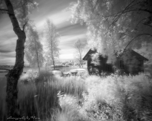
I'm extremely excited for this assignment, because being a photographer, I would love to try this new style. The picture above really follow Impressionistic styles and techniques. It's dreamy, a little blurry, and it resembles blotted paint strokes. I believe it will be a little bit of a challenge to incorporate rhythm into this since the majority of Impressionistic photos have a soft look that flows. However, I think that will make for a really interesting and striking image. I'm gong to accomplish rhythm through the use of my helper media. 
     Because I need to show a breadth of things in this project and throughout the whole class in general, I'm going to mix photography and acrylic paint, the paint being my helper media. Impressionistic photography already has a very soft and painterly feel to it, but I'm going to attempt to make the photos just slightly sharper than the one above and add the soft paint feel to it through the actual use of acrylic paint. Through the direction of my brush strokes, I will add slightly noticeable rhythm. Just enough to incorporate it, but not too much as to distract from the smooth feel of the image. 

Wednesday, September 4, 2013

Wisconsin Art

Sunrise, Lake Minocqua


I LOVE these two pictures from portalwisconsin.org. They both have amazing contrast, lines, and shadows. They also share a kind of asymmetrical balance that is interesting with the scenery.
Law Office

PortalWisconsin was an effective website to use. I really appreciated the professional manner of this site. It was nice, because not only was it well organized and easy to operate, but that enhanced my overall experience discovering new photography and artwork.
    It also gave off a very strong sense of community. I could tell that by their scheduled activities and events, their many offered opportunities for grants or internships, and recognition of the effort kids put into their art, that this site is very intune to its community, especially its young artists.


Artsboard.wisconsin.gov

I didn't really like this website. It was confusing to use. I couldn't even find a section of the site for photography, so there's no pictures. However, I did learn that they offer many grant programs, internships, and they promote art in many different ways. It's a very good site for community building among lovers of art.


Kitchen LightScholastic.com was really fun to look through. It was an easy way to discover art from fellow students. I really like these two pictures because the contrast and editing is intense and caught my eye instantly. It makes me wonder what the photographer was thinking when they took these. I learned three things from this site. First, was that scholastic had programs to recognize young artists! I wasn't even aware they did this. Second, I learned that they could offer scholarships for the fortunate young artists who stood out. Lastly, I learned that professional, well-respected and well recognized artists are a part of this board. How cool would it be to have your art praised by Andy Warhol?!


Behind The Wire